The Problem
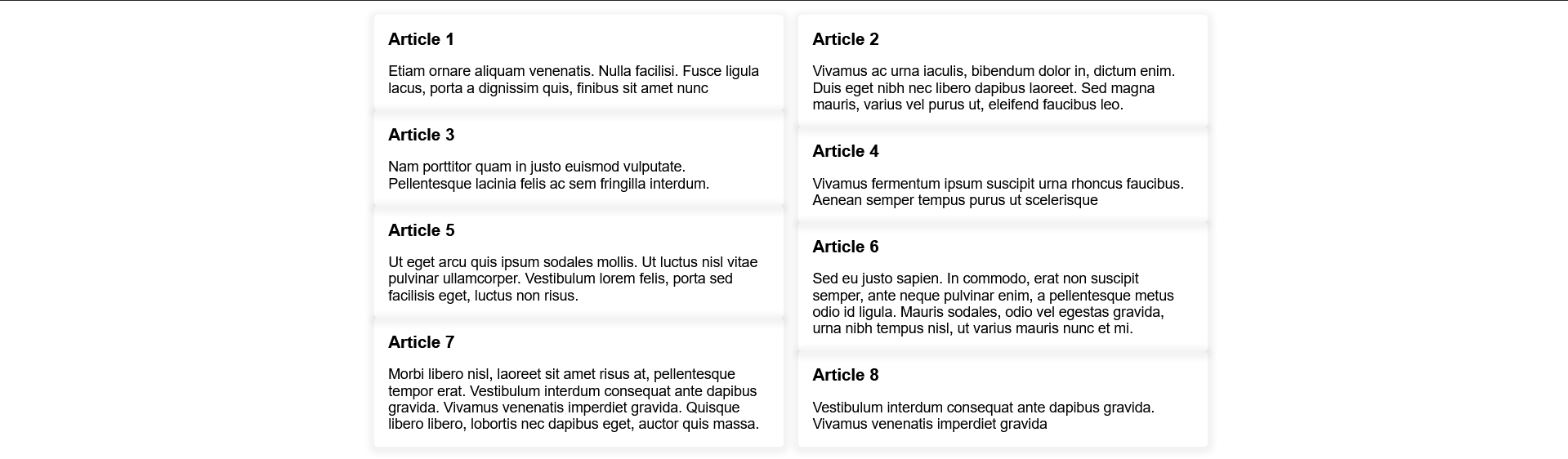
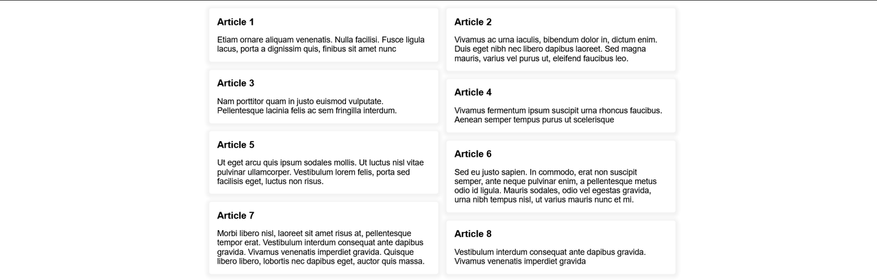
When I was designing this blog I wanted to create a masonry grid layout for the articles page.
I encountered one problem which is that grid-template-rows: masonry wasn't supported in any browser except firefox.
I found a library solution, but I had already the grid done I wanted something that can be used as the native option.
So I found this article which literally achieved my goal.
To be honest, understanding that article was hard for me so I wrote this to re-explain it so that I can understand the solution more.
I hope you don't face any difficulty understanding my explanation.
The Solution
-
Take a ref of the grid container.
-
Whenever the component mounts store some information about the grid such as the row gap, the number of columns, and the grid items.
-
Loop throw the grid items and calculate the
margin-topof it based on the information that we stored.
Now, We will take every step of these and understand it more.
Step 1: Take a ref of the grid container
const ArticlesList = () => {
  const gridContainerRef = useRef();

  return (
    <div className="container" ref={gridContainerRef}>
      {articlesData.map((articleData, index) => (
        <Article key={index} {...articleData} />
      ))}
    </div>
  );
};
Step 2: Store information about the grid
useEffect(() => {
  const gridEl = gridContainerRef.current;

  const gridInfo = {
    items: Array.from(gridEl.querySelectorAll(".article")),

    rowGap: parseFloat(
      getComputedStyle(gridEl).getPropertyValue("grid-row-gap")
    ),

    columnsNumber: getComputedStyle(gridEl)
      .getPropertyValue("grid-template-columns")

      .split(" ").length,
  };
}, []);
Step 3: Loop throw the grid items
This one is the hardest part.
These are the things that we will do
-
Loop throw them
-
Skip the first row
-
For any grid item that isn't in the first row, we will get the grid item above it.
-
Calculate the margin-top of the current grid item and set it.
Now as you know we have the grid item above the current grid item in the loop.
So we will use getBoudingClientRect to get the bottom edge of the grid item above and the top edge of the current item.
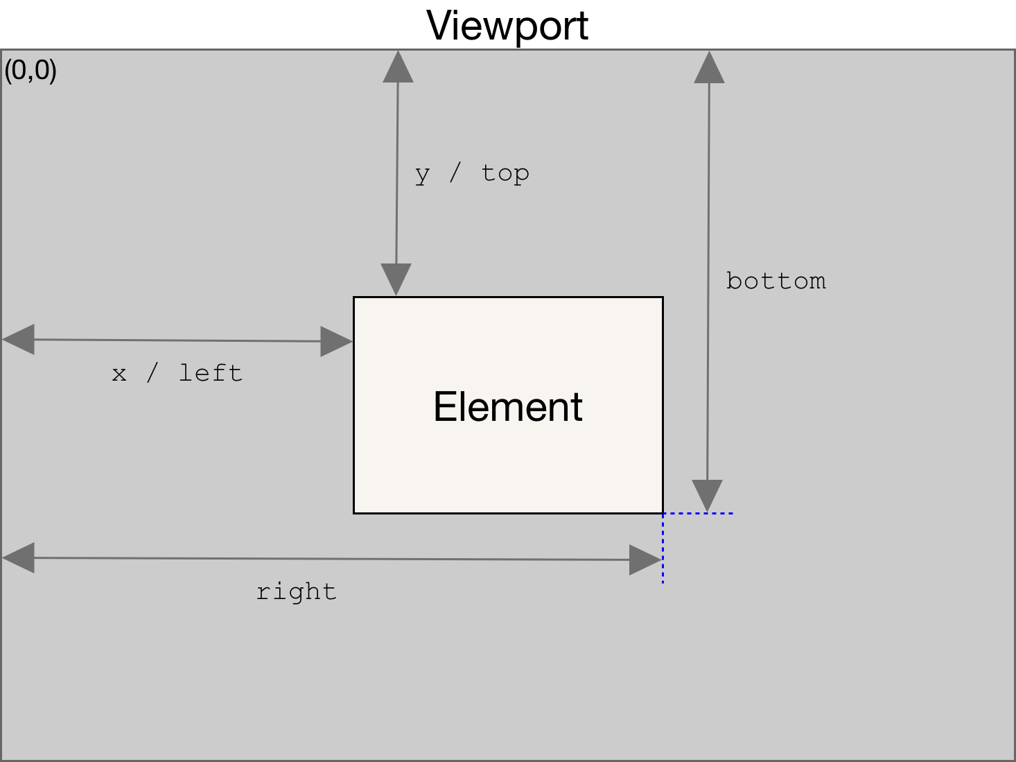
getBoundingClientRectreturns a number that indicates the destination between the top edge of the viewport and the edge of our element as specified in the diagram above.
To calculate the margin of the current element use this formula $current-item-top-edge - $above-item-bottom-edge.
Now when you try this formula you will notice that the current gird item is stuck to the item above it and this is the reason that we stored the row gap.
This is the final formula $current-item-top-edge - $above-item-bottom-edge + $grid-row-gap.
useEffect(() => {
  // 1.
  gridInfo.items.forEach((item, index) => {
    // 2.
    if (index < gridInfo.columnsNumber) return;
    // 3.
    const itemAbove = gridInfo.items[index - gridInfo.columnsNumber];
    // 4.
    item.style.marginTop = `${
      itemAbove.getBoundingClientRect().bottom -
      item.getBoundingClientRect().top +
      gridInfo.rowGap
    }px`;
  });
}, []);
Problem: Responsive grid
Now if your grid is responsive we need to re-run this function whenever the number of the gird columns changes.
To do that we need to:
-
Wrap this logic in a function
-
Call this function whenever the component mounts.
-
Add a listener to every resize.
-
Recall the function whenever the number of columns changes.
When you do that don't forget to set the margin-top of the grid item to 0 in each layout before setting the new value (If you don't do so the old value and the new value will be added).
useEffect(() => {
  const gridEl = gridContainerRef.current;
  const gridInfo = {
    items: Array.from(gridEl.querySelectorAll(".article")),
    rowGap: parseFloat(
      getComputedStyle(gridEl).getPropertyValue("grid-row-gap")
    ),
    columnsNumber: getComputedStyle(gridEl)
      .getPropertyValue("grid-template-columns")
      .split(" ").length,
  };

  // 1.

  const layout = () => {
    gridInfo.items.forEach((item, index) => {
      if (index < gridInfo.columnsNumber) return;
      const itemAbove = gridInfo.items[index - gridInfo.columnsNumber];
      // *
      item.style.marginTop = 0;
      item.style.marginTop = `${
        itemAbove.getBoundingClientRect().bottom -
        item.getBoundingClientRect().top +
        gridInfo.rowGap
      }px`;
    });
  };
  // 2.
  layout();
  // 3.
  window.addEventListener("resize", (e) => {
    // 4.
    const currentColumnsNumber = getComputedStyle(gridEl)
      .getPropertyValue("grid-template-columns")
      .split(" ").length;
    if (currentColumnsNumber === gridInfo.columnsNumber) return;
    gridInfo.columnsNumber = currentColumnsNumber;
    layout();
  });
}, []);
Full example
Notes
In this article I just talked about implementing it with javascript immediately without checking if the browser supports it or not.
If you want to check if the browser supports it or not before using the javascript code add this code.
useEffect(() => {
  if (
    getComputedStyle(gridEl).getPropertyValue("grid-template-rows") !==
    "masonry"
  ) {
    // the logic that we implemented in the article
  } else {
    console.log("You're browser support masonry grid 🎉🎉🎉");
  }
}, []);
You can tell me what do you think about this article by Sending me an email.